In the post about stacks we looked at the individual tools of horizontal, vertical, and z-axis stacks. When used on their own they’re useful ways of laying out views along a single axis. But when used together they’re a powerful way of creating even the most complicated layouts.
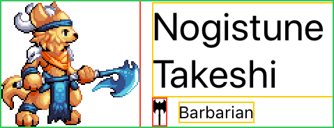
Let’s continue our example of a character card, and see how we can combine stacks to make a more interesting view that shows the image, name, and class as below:

We can see that we’re going to need two Image views: one for the
character, and one for the class icon; and we’re also going to need two
Text views: one for the name, and one for the class.
But how many stacks are we going to need, and of what types?
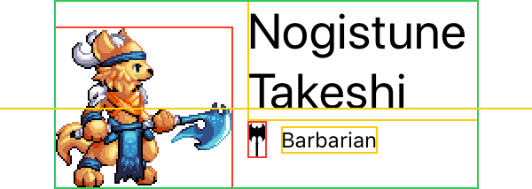
A simple approach I like to use to figure out the answer is to draw lines from edge to edge across the layout where the dividers between views are:

What we’re looking for is a line that runs from one side of the layout to the other without crossing through any other view, this gives us our first stack division.
It’s not #2 because that passes through the character picture, and it’s not #3 because that passes through the character name. The only line that doesn’t pass through any view is #1, this vertically divides the space between the character picture on the left, and the details on the right.
Because it’s a vertical line, that means we want a horizontal stack.
struct ContentView : View {
    var body: some View {
        HStack {
            // TODO
        }
    }
}
To the left of it is only the character picture, we can disregard line #2 because that goes under the text that’s on the right hand side.
Since we don’t need to divide up the left side any further, let’s go
ahead and put the Image in:
struct ContentView : View {
    var body: some View {
        HStack {
            Image("barbarian")
            // TODO
        }
    }
}
On the right hand side we still have lines #2 and #3 to deal with. We might be tempted to continue the horizontal stack for the class icon, but as we can see the line that divides from the class name still passes through the character name, so we can’t do that yet.
But line #2 now cleanly divides the remainder on the right of line #1, and since that’s a horizontal line, this means we want a vertical stack:
struct ContentView : View {
    var body: some View {
        HStack {
            Image("barbarian")
            VStack {
                // TODO
            }
        }
    }
}
Above this line we have just the character name, so we can put that in:
struct ContentView : View {
    var body: some View {
        HStack {
            Image("barbarian")
            VStack {
                Text("Nogistune Takeshi")
                    .font(.title)
                // TODO
            }
        }
    }
}
Below the line we still have two views, separated cleanly by line #3. Vertical line means a horizontal stack, and since we know what we’re doing, we can go ahead and just put those views in it:
struct ContentView : View {
    var body: some View {
        HStack {
            Image("barbarian")
            VStack {
                Text("Nogistune Takeshi")
                    .font(.title)
                HStack {
                    Image("class_icon")
                    Text("Barbarian")
                }
            }
        }
    }
}
Note that we not only have a combination of a horizontal and vertical stack, but the vertical stack embedded in the horizontal stack also has another independent horizontal stack within it.
This kind of arbitrary nestability of the stacks is part of their power.
So let’s see how this looks:

Alignments
That’s pretty close, but it’s still not exactly what we were going for. Everything has been laid out in the right rough general area, but SwiftUI’s preference for center alignment has taken over.
Fortunately we can change that, and if you haven’t reviewed my post on alignments now is a good time to do so.
Recall that each stack has its own alignment for the children positioned within it, and that the alignment of a stack is perpendicular to the direction of its layout.
When combining stacks, remember that a stack is tightly wrapped around its children and participates in the layout process of its parent accordingly.
Let’s look in a little more detail at the above by showing the borders of all of the individual stacks:

This makes it clearer that the horizontal stack around the class icon and name has been centered within the vertical stack shared with the character name.
So if we want to leading align those views together, it’s the alignment of the vertical stack we change.
The vertical stack has also placed spacing between them, and we can remove that at the same time:
struct ContentView : View {
    var body: some View {
        HStack {
            Image("barbarian")
            VStack(alignment: .leading, spacing: 0) {
                Text("Nogistune Takeshi")
                    .font(.title)
                HStack {
                    Image("class_icon")
                    Text("Barbarian")
                }
            }
        }
    }
}
By carefully considering the layout and desired effect, we only needed to make one small change:

Custom Alignments across Stacks
The default centering behavior for everything else seems to work pretty well, but after a while we get a bug that on smaller devices, the text wraps:

While this looks fine to us, the feedback from users, or designers, is that the class moving up and down relative to the picture is undesired. Instead they want the character name to grow upwards away from the class.
This is a good use for a custom alignment, which I cover in a bit more
detail in the alignments
post. After reading that, we might guess that we want the .center of
the character picture Image to be aligned with the .lastTextBaseline
of the Text for the character name.
Since these are vertical alignments, that means we’d apply the custom
alignment to the HStack:
extension VerticalAlignment {
    enum Custom: AlignmentID {
        static func defaultValue(in d: ViewDimensions) -> CGFloat { d[.top] }
    }

    static let custom = VerticalAlignment(Custom.self)
}

struct ContentView : View {
    var body: some View {
        HStack(alignment: .custom) {
            Image("barbarian")
                .alignmentGuide(.custom) { d in d[VerticalAlignment.center] }
            VStack(alignment: .leading, spacing: 0) {
                Text("Nogistune Takeshi")
                    .font(.title)
                    .alignmentGuide(.custom) { d in d[.lastTextBaseline] }
                HStack {
                    Image("class_icon")
                    Text("Barbarian")
                }
            }
        }
    }
}
But the Text we want to align is within a VStack, how do we handle
that? Fortunately we don’t have to:

Because the Text is the only view within the VStack that defines a
value for the .custom alignment we created, the VStack itself has
the same value for the alignment.
This allows it to be aligned with its sibling Image according to an
alignment guide set by one of its children.
Remember that a vertical alignment is always used by a horizontal stack, and a horizontal alignment used by a vertical stack. But a horizontal stack can (and will) apply a vertical alignment to a vertical stack child, and vice-versa.