Secondary views are one of the more interesting layout tools available in SwiftUI, to understand them first we have to recall that views choose their own sizes. To recap the process:
- Parent proposes a size to its child.
- Child decides on its size.
- Parent positions the child within its bounds.
Secondary views are useful because of where they fit in to this process, and how they interact with it. To demonstrate, let’s use a simple example:
struct ContentView : View {
    var body: some View {
        Text("Hasty River")
            .font(.title)
            .background(Color.yellow)
    }
}
We create a Text which will have a fixed size of its content, and then
we add a secondary view using .background; the value of this is the
secondary view added, in this case, a Color.
Color when used as a View simply sets its size to the proposed size
received from its parent, fillings its bounds.

The result shows us that the proposed size for the secondary view is the size chosen by the view its attached to.
the proposed size for the secondary view is the size chosen by the view its attached to
So we can refine our process a little:
- Parent proposes a size to its child.
- Child decides on its size.
- Child proposes its size to its secondary view(s).
- Secondary view decides on its size.
- Parent positions the child within its bounds.
In our first experiment we just filled the secondary view with a color,
what if we use a view there that’s inflexible about its size, and ends
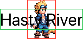
up being larger than the child? Perhaps an Image:
struct ContentView : View {
    var body: some View {
        Text("Hasty River")
            .font(.title)
            .background(Image("rogue"))
    }
}
If we’ve been paying attention we’re almost certainly going to expect that to break out of its bounds, but how does that affect the frame of the child its attached to?

The answer is that it doesn’t, the frame of the Text in green remains
unaffected by the frame of the secondary view in red. All that happens
is that the child positions its secondary view, even though it
overflowed.
So now our process looks like:
- Parent proposes a size to its child.
- Child decides on its size.
- Child proposes its size to its secondary view(s).
- Secondary view(s) decides on their size.
- Child positions its secondary view(s) within its bounds.
- Parent positions the child within its bounds.
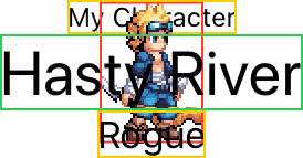
To see how this interacts with other views, let’s do a side-experiment
using a VStack and some other lines of text:
struct ContentView : View {
    var body: some View {
        VStack {
            Text("My Character")
                .font(.caption)
            Text("Hasty River")
                .font(.title)
                .background(Image("rogue"))
            Text("Rogue")
        }
    }
}
If the secondary view has any part to play in the layout, we would expect to see the vertical stack account for it:

The vertical stack ignored the secondary view completely; indeed everything we’ve learned about stacks should mean this isn’t a surprise.
We saw above that the Text did not change its size to account for the
overflowing secondary view, so there was no way for the stack to account
for it; after a view positions its secondary views they are otherwise
completely removed from the layout process.
after a view positions its secondary views they are otherwise completely removed from the layout process
So a secondary view gives us two things:
- a view that has a proposed size that is the decided size of the view it is attached to.
- a view that is otherwise removed from the layout process.
The latter has the most utility in creating background views using
.background, or overlay views using .overlay, that might be larger
than their parent.
The former though can be extraordinarily useful in custom controls, we’ll look at making one in secondary views in practice.
ZStack as a Secondary View
When we looked at stacks, we covered the basics of the z-axis stack and mentioned that the size of the stack is the union of the bounds of all its children with the highest layout priority.
By using sets of children with different layout priorities, we can
replicate the implementation of .background and .overlay within a
ZStack.
For example, our initial example with a colored background:
struct ContentView : View {
    var body: some View {
        Text("Hasty River")
            .font(.title)
            .background(Color.yellow)
    }
}
Has an equivalent expression using a z-axis stack:
struct ContentView : View {
    var body: some View {
        ZStack {
            Color.yellow
                .layoutPriority(-1)

            Text("Hasty River")
                .font(.title)
    }
}
The ZStack first processes the Text child since it has the highest
layout priority, and then chooses its own size as the same size, since
there are no other children with that layout priority.
Next the Color receives as its proposed size the size of the stack,
and since it’s completely flexible, occupies all of that space.
Note that the layout priority has no effect on the z-axis ordering of
the children, and that the Color is still placed behind the Text.
.overlay can be replicated similarly, with the lower layout priority
children being placed after those with a higher priority, so they appear
on top.