The three most important layout tools in your SwiftUI toolbox are the three kinds of stacks: horizontal, vertical, and z-axis (yes, there really is no good adjective for this one).
These views are parents to multiple children, and in order to fully understand how these lay them out, you should first understand that views choose their own sizes.
Horizontal Stack
A horizontal stack is created using an HStack and a view builder that
specifies its children:
struct ContentView : View {
    var body: some View {
        HStack {
            Image("barbarian")

            Text("Nogistune Takeshi")
                .font(.title)
        }
    }
}
It lays out its children sequentially from its leading edge to its trailing edge:

We can learn a lot by extending and constraining this simple example.
The first child is an Image which chooses its size to be the size of
its source image. The second child is a Text which has chosen its size
as that needed to render its string in the chosen font.
The Text is placed horizontally in the stack after the image, with
space between them. We can specify the amount of space we want with the
optional spacing parameter to the HStack, or we omit the parameter
as we did here to allow the stack to choose the spacing.
When we allow the stack to choose the spacing, it does not choose a fixed value, but a value that makes sense for each specific pair of children.
Since the Text is not as tall as the Image, the stack vertically
centers it. This is an entire topic in of itself, and you can read more
in alignments. For now we’ll
stick to the default centering behavior.
The width of the stack is the sum of the widths of its children, plus the spacing between them.
In the example above the stack has the height of the first child, the
Image, which also happens to be the tallest. We can verify whether the
height of the stack is that of the first child, or the tallest, by
switching the order:
struct ContentView : View {
    var body: some View {
        HStack {
            Text("Nogistune Takeshi")
                .font(.title)

            Image("barbarian")
        }
    }
}
If the stack took the height from the first child, the Image would
have had to overflowed the stack’s bounds; as we see, it does not:

This confirms that the height of the stack is the height of the tallest child. When we look at alignments we’ll learn that the height of the stack also includes the vertical positions of its children, thus a more general rule is that the stack’s bounds are the union of the bounds of its children.
the stack's bounds are the union of the bounds of its children
We can confirm that the stack’s bounds are derived from the children by looking at what happens if the size of the device is larger than the combined sizes of the stack’s children:
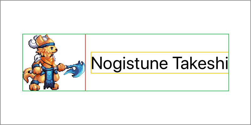
The stack does not expand to fill the size proposed by the device, its parent. The children of the stack chose their own sizes, and stacks are no different. Stacks choose their own sizes, derived from the sizes of their children.
Stacks when Constrained in Size
We know that views choosing their own
sizes
doesn’t mean that they can’t be flexible about the size that they
choose, and we saw in that post that Text can return different sizes
by truncating, tightening, and wrapping its string.
Let’s take a look at what happens when there is not enough space available for all of the children of the stack to be laid out horizontally.
We can do this by adding a .frame to the stack, which as we should
recall, creates a new view with the stack as a child, and proposes the
size given to it to the stack:
struct ContentView : View {
    var body: some View {
        HStack {
            Image("barbarian")

            Text("Nogistune Takeshi")
                .font(.title)
        }
        .frame(width: 280, height: 100)
    }
}
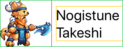
Since there is not enough space for both the Image and the Text to
be laid out horizontally, the Text can help out by wrapping its
contents, reducing its width by increasing its height:
But what if we had more than one Text in our stack, which one would
adjust its size?
To see what happens, let’s divide our single Text into two, one each
for the character’s family name and given name respectively. Since we
want the Text to be truncated rather than wrapped, we’ll also throw in
a .lineLimit:
struct ContentView : View {
    var body: some View {
        HStack {
            Image("barbarian")

            Text("Nogistune")
                .font(.title)
            Text("Takeshi")
                .font(.title)
        }
        .lineLimit(1)
        .frame(width: 280, height: 100)
    }
}
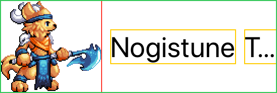
Rather than allowing the first Text to take up most of the space, and
the second to extra-truncated to fit, the stack instead divides the
space up fairly between them and causes both to truncate:

Yet while the space has been fairly divided between the Text children,
the Image doesn’t seem to have been affected.
Proposed Sizes in Stacks
We gave a warning in views choose their own sizes to not confuse the proposed size a view receives from its parent with the size the parent chooses for its own, and now we can review why.
Like every view the stack receives a proposed size from its parent; in our examples, a frame or the device. And as we’ve already seen, the size of the stack is derived from the size of its children.
When the stack lays out its children, they receive a proposed size from the stack, but that proposed size cannot be the size of the stack since it has not been chosen yet. Neither is it the proposed size the frame received from its parent, which would not fairly distribute space as we’ve seen the stack does.
Instead the stack makes proposed size offers to its children in order of their increasing horizontal flexibility.
The stack begins with the proposed size it received from its own parent, and since it knows how many children it has and how much space to place between them, it can subtract the sum of the necessary spacing to obtain the space available for all of its children, which it can then divide equally
As the least flexible child, the Image receives the first offer of a
proposed size. Since the Image is inflexible, it chooses a size
without considering this. The stack subtracts the chosen size from the
available space, and then divides the remainder equally again.
As the more flexible children, the two Text views next receive an
offer of a proposed size, taking their equal share of the remainder and
truncating equally.
In flexible frames we’ll learn how we can adjust a view’s flexibility by specifying minimum and maximum lengths.
Layout Priorities
If we want a little more control, for example if we want the character’s family name to be less likely to be truncated than their given name, stacks give us a way to control the order in which children are laid out.
By increasing the layout priority of certain children, the stack introduces an extra layout pass for those children before their siblings:
struct ContentView : View {
    var body: some View {
        HStack {
            Image("barbarian")

            Text("Nogistune")
                .font(.title)
                .layoutPriority(1)
            Text("Takeshi")
                .font(.title)
        }
        .lineLimit(1)
        .frame(width: 280, height: 100)
    }
}
After subtracting spacing from the proposed size, the stack will consider children in order of decreasing layout priority. For those of the same layout priority, the stack as before will make offers in order of their increasing horizontal flexibility.
So in this example we’ve increased the priority of the Text containing
the family name, ensuring that is laid out first, and gets the space it
needs.
Next the two remaining children with a default zero layout priority are
considered. Since the Image is the least flexible, that receives the
first offer and chooses its size. Finally the Text containing the
given name is proposed the remainder.
Vertical Stack
The vertical stack is very similar to the horizontal, it is defined with
VStack:
struct ContentView : View {
    var body: some View {
        VStack {
            Image("barbarian")

            Text("Nogistune Takeshi")
                .font(.title)
        }
    }
}
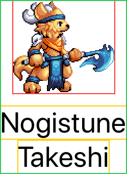
Rather than laying out its children horizontally, it lays out its children sequentially from its top edge to its bottom edge:
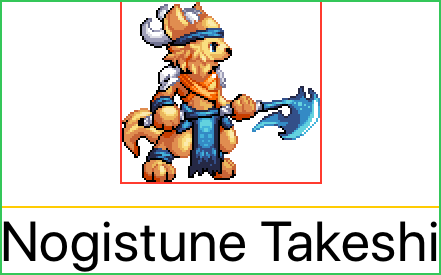
Just like the horizontal stack, each child view chooses its own size, and. the vertical stack itself chooses its own size, derived from the sizes of its children.
Vertical stacks obey all of the same rules and constraints as horizontal stacks, just in a perpendicular axis.
Since it’s arranging its children vertically, it’s the width of the vertical stack that is the width of its largest child. Smaller children are positioned horizontally within that space, with the default alignment to be centered.
Vertical stacks can be particularly useful to demonstrate the default spacing behavior, for example if we split the surname and family name as we did for a horizontal stack example above:
struct ContentView : View {
    var body: some View {
        VStack {
            Image("barbarian")

            Text("Nogistune")
                .font(.title)
            Text("Takeshi")
                .font(.title)
        }
    }
}
The result includes spacing between the Image and first Text child,
but no spacing between the two adjacent Text children:
Z-Axis Stack
The third kind of stack is neither horizontal or vertical, but instead
overlays its children on top of each other. It is defined using
ZStack:
struct ContentView : View {
    var body: some View {
        ZStack {
            Image("barbarian")

            Text("Nogistune Takeshi")
                .font(.title)
        }
    }
}
The children are overlaid sequentially, with the first defined on the bottom and the last defined on top:
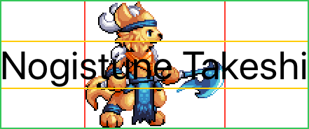
Just like the horizontal and vertical stacks, each child view chooses its own size, and the z-axis stack itself chooses its own size too, derived from the sizes of its children.
While it might seem limited in usefulness, the z-axis stack can actually be one of the most powerful tools for combining views, and is one of the fundamentals for creating new controls, or overlaying shapes.
In this simple example all of the children are laid over top of each other. We’ll learn when we look at alignments that we can move them apart from each other, and in exploding stacks how we can combine alignments and flexible frames inside a z-axis stack.
As with the horizontal and vertical stacks, the bounds of a z-axis stack are the union of the bounds of its children; but with an added twist: only the bounds of its children with the highest layout priority. We’ll look at this in more detail when we look at secondary views.
Combining Stacks
More complex layouts can be created by combining stacks together, a topic complex enough to deserve its own post.