One of the first things presented about SwiftUI is that its views choose their own sizes, and that once chosen, those choices cannot be overridden. This is such a simple statement that it would be easy to move on quickly to get to the good stuff.
This would be a mistake, because this simple statement fundamentally changes everything you know about layout. Failing to take the time to learn SwiftUI will leave you constantly feeling like your fighting to achieve even the simplest layouts. This would be a mistake as the design of SwiftUI has significant benefits over UIKit and AppKit, and it’s worth learning to think differently.
In this post we’ll look at two views that form the basic building blocks
of many layouts, and what this assertion means for them: Image, and
Text.
Images
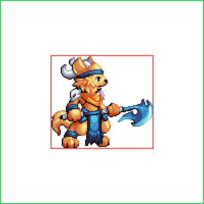
Let’s start by placing an Image in our layout:
struct ContentView : View {
    var body: some View {
        Image("barbarian")
    }
}
The specific image we’ve used has a size of 101 × 92 pixels and the resulting view has the same size, centered on the screen of our device:

The preview above is rendered using SwiftUI and includes additional borders to help visualize the layout. In this preview, and in future previews, a red border is used to show the bounds of images, and a gray border shows the bounds of the device. We’ll learn more about secondary views such as borders in other posts, but when they are only used to clarify the bounds of views in examples, we’ll omit them for clarity.
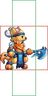
We can use the .frame modifier on the image to place it inside a
frame:
struct ContentView : View {
    var body: some View {
        Image("barbarian")
            .frame(width: 200, height: 200)
    }
}
Coming from UIKit or AppKit, this may not be what we expected:
Rather than stretching to fill the frame, the image has retained its chosen size and been centered within the frame’s bounds. In the preview above, and in future previews, we’ll use a green border to denote the bounds of frames.
It turns out that .frame does not modify the properties of the view it
is applied to; it creates a new “frame” view with the specified size,
and positions the view it’s applied to (the Image in this case) as a
child inside it.
`.frame` does not modify the properties of the view it is applied to; it creates a new "frame" view with the specified size, and positions the view it's applied to as a child inside it.
This is worth taking a moment to consider, because it’s a fundamental of
SwiftUI. Modifiers like .frame create new parent views containing the
view they are applied to as a child, and are extremely useful for
building layouts of smaller views.
The size chosen by the Image view is based on the dimensions of the
image and its properties in the asset catalog. This size cannot be
overridden by its parent.
For an extreme demonstration of this, we can try and place the image inside a frame that’s too small for it:
struct ContentView : View {
    var body: some View {
        Image("barbarian")
            .frame(width: 50, height: 200)
    }
}
We might have expected the Image to be resized, at least in this case
even if not the other, but in fact it simply overflows the frame’s
bounds:
We can use this behavior to create overlaid views, or we can customize
it through clipping modifiers such as .clipped or .cornerRadius to
constrain the drawing to the frame’s bounds. Since this post is about
layout, we’ll cover those in future posts.
We’ll come back to images again, but we need to learn more first, so
we’ll take a look at Text instead.
Text
Let’s replace the Image in our layout with some Text instead,
perhaps the name of our barbarian character:
struct ContentView : View {
var body: some View {
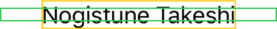
Text("Nogitsune Takeshi")
}
}
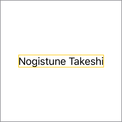
In this preview, and in future previews, we’ve added a yellow border to show the bounds of text, and again used the gray border to denote the size of the device.
Just like Image before, the Text has been centered within the bounds
of the device. Text too has a chosen its size, which is simply the
size necessary to render the string given to it.
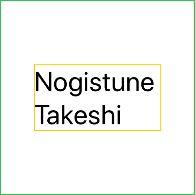
As with images, we can add a .frame to text views to build larger
layouts:
struct ContentView : View {
    var body: some View {
        Text("Nogitsune Takeshi")
            .frame(width: 200, height: 200)
    }
}
Knowing that a .frame creates a new view that contains the Text, we
we should not be surprised that the size of the Text remains the same
as before, and that it’s simply centered within the frame just as it was
previously centered within the device:

Text gives us a few different ways to influence the size it chooses,
for example by specifying the .font that we want to use.
It’s our hero’s name, so let’s use a .title font:
struct ContentView : View {
    var body: some View {
        Text("Nogitsune Takeshi")
            .font(.title)
    }
}
As we would expect, since it’s now using a larger font, the view now has a larger size than it had before:

So to complete the loop, let’s place our larger title-font Text inside
a frame that would be too small for it:
struct ContentView : View {
    var body: some View {
        Text("Nogitsune Takeshi")
            .font(.title)
            .frame(width: 200, height: 200)
    }
}
We saw with similar code using Image that it kept its chosen size and
overflowed the bounds of the .frame. But Text has already let us
change its size through the .font modifier, so we might expect
different behavior:
Instead of overflowing the bounds of its parent frame, the Text was
able to choose a different size that fit within it. In this case it
wrapped its content, choosing a size lesser in width but greater in
height.
This doesn’t contradict what we’ve just learned about chosen sizes not being able to be overriden, it actually demonstrates another key principle we haven’t learned yet: a view receives a proposed size from its parent before it chooses its own size.
a view receives a proposed size from its parent before it chooses its own size
It’s important not to confuse this proposed size a view receives from its parent with the size the parent chooses for itself. In most cases in SwiftUI a parent view chooses its size based on the size of its children. We’ll learn more about this later when we look at flexible frames.
Proposed Sizes
Understanding what happened in the previous example, and the process by which the views were sized, and positioned, is key to understanding the flexible nature of SwiftUI’s layouts.
The Text view chooses its own size, and once chosen that size cannot
be overridden. But Text is also flexible as to what sizes it can
choose, depending on the proposed size it receives from its parent; in
this case the frame we added to it.
We’ve specified a size of 200 × 200 for the frame, so when the frame is
ready to position the Text inside it, it proposes the same size to its
child, and only then asks the child to choose a size. In the example
without the frame, the Text received a proposed size of the bounds of
the device itself.
In the example with the frame, the width proposed was insufficient to render the entire string, but there was sufficient height available to wrap the contents over two lines instead.
Once Text has determined the best way to layout its contents within
the proposed size, it then chooses the size necessary to render its
contents in that way.
The size chosen is still usually smaller than the proposed size, and always tightly hugs the content; it does not grow to fit. As you can see in the example above, it did not simply choose the proposed width as its own width, it chose the largest width necessary for the line-wrapped string, and it was still necessary for the frame to center the text within it.
Just as with Image being too large for the frame, a similar case
occurs when a frame is added to a Text without enough height, for
example:
struct ContentView : View {
    var body: some View {
        Text("Nogitsune Takeshi")
            .frame(width: 200, height: 10)
    }
}
Just as Image overflowed the proposed size from the frame when it was
too small, so does Text:
Text Truncation
Wrapping is not Text’s only trick for choosing a different size, it
can also tighten by compressing space between characters, and it can
decrease its width and height by truncating its content, rendering a
shortened version of the string with an ellipsis:
struct ContentView : View {
    var body: some View {
        Text("Nogitsune Takeshi")
            .font(.title)
            .lineLimit(1)
            .frame(width: 200, height: 200)
    }
}
Here we’ve added a .lineLimit modifier removing the default unlimited
number of lines and replacing it with a new value of 1, this forces
Text to use a different approach for choosing its size when the
proposed size is not sufficient:
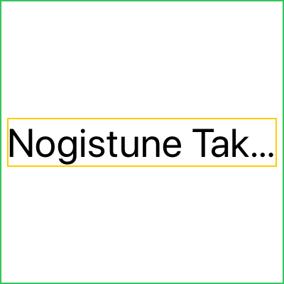
Since the Text wasn’t able to fit the full width of the string in the
space proposed, and was not permitted to use multiple lines, the Text
instead decreased its width by truncating its contents.
Note again that the width chosen by the Text is only enough to render
the truncated line, and it is still centered within the frame.
The same truncation can occur in the situation where there isn’t sufficient proposed height for the text to expand to multiple lines, for example:
struct ContentView : View {
    var body: some View {
        Text("Nogitsune Takeshi")
            .font(.title)
            .frame(width: 200, height: 50)
    }
}
Even though no line limit is specified, the proposed height from the frame is only sufficient for a single line, so the content is truncated to fit the proposed space in this example too:

Resizable Images
Now that we’ve learned that a view choosing its own size doesn’t mean
the view can’t be flexible about what that chosen size is, we can
revisit Image.
By default images have the size of their source, but they have the option to be resizable:
struct ContentView : View {
    var body: some View {
        Image("barbarian")
            .resizable()
            .frame(width: 200, height: 150)
    }
}
A resizable image chooses the same size proposed by its parent, entirely filling any available space:

By default the image will fill the space by stretching the source image,
but by using .resizable(resizingMode: .tile) it would have repeated
the source image:
struct ContentView : View {
    var body: some View {
        Image("barbarian")
            .resizable(resizingMode: .tile)
            .frame(width: 200, height: 150)
    }
}
Note that the size of the Image is still the proposed size of the
frame, it’s simply rendering the source image multiple times within its
bounds:

In many cases neither of those behaviors are what we want, and instead we want the image to fill as much of the parent as possible, while retaining the aspect ratio of its source.
Fortunately there’s a modifier to specify that too called
.aspectRatio.
But we can’t just specify that alone, we still need the .resizable
modifier since we want to constrain the aspect ratio of the image after
making it resizable.
Modifier Ordering
When specifying multiple modifiers, the ordering matters. Since each modifier applies to the view it’s added to, adding a corresponding superview to the view hierarchy, this means that in SwiftUI modifiers are written from the inside out.
in SwiftUI modifiers are written from the inside out
To make a resizable image constrained by the aspect ratio of the source, we need to specify both modifiers, as well as the frame:
struct ContentView : View {
    var body: some View {
        Image("barbarian")
            .resizable()
            .aspectRatio(contentMode: .fit)
            .frame(width: 200, height: 150)
    }
}
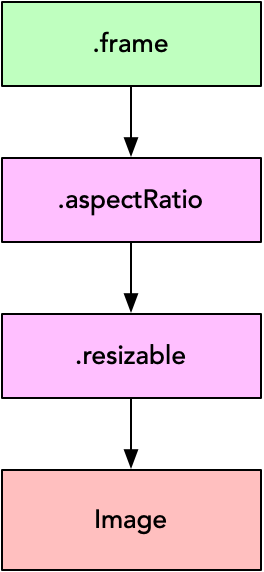
In this example code, the .resizable modifier is added to the Image
view, which means that Image becomes a child of the .resizable
modifier just as it was of .frame in our earlier examples.
Then when we wish to add a second .aspectRatio modifier, it is the
resizable image that we wish to constrain the aspect ratio of, so we
add this modifier to the end of that chain.
Finally it is the aspect-ratio constrained resizable image that we
wish to place inside the .frame, so the frame comes last. It’s
important to remember that while the .frame is listed last in the
chain, it is the top-most parent, and that the Image while listed
first, is the bottom-most child.
The results are what we intended:

Based on the size of its source, and of the proposed size from the
parent, the Image has chosen to use the proposed height of the parent,
scaling the source up to fit, and has chosen a width that retains the
aspect ratio of the original source.
Since the Image therefore no longer utilizes the full size of its
parent, the parent centers it.
With these rules firmly in our minds, we can now look at combining multiple views in our layouts by using stacks, or look at the interesting case of flexible frames.